I’m always looking forward to learning new things, and this time Jetpack Compose was the thing I decided to learn.
I use Google Sheets to keep track of my income/expenses so I decided to build an app using Compose that would do same.
In this article I’ll be showing the mistakes I made and how I built some of the customized components that were used in the project.
Home Background Banner
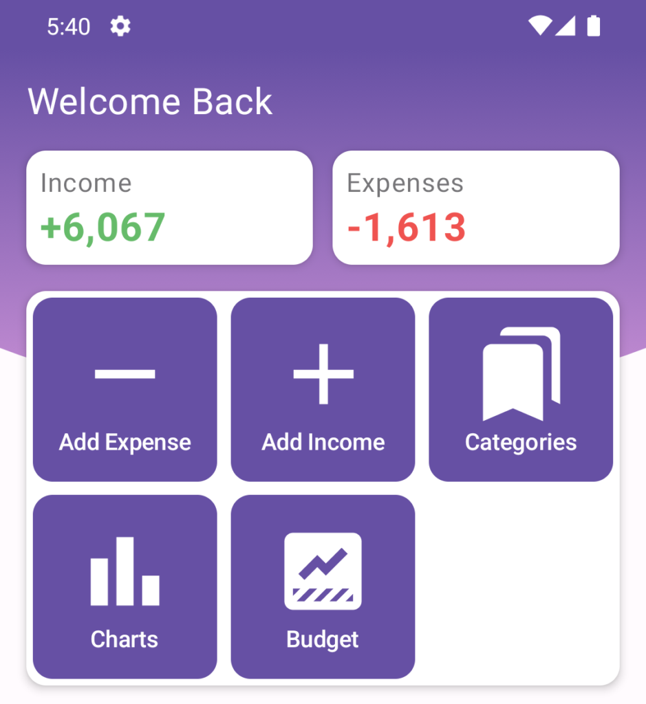
I was looking for inspiration and came across some other apps that used this curved background, so I decided to use it for the home header.
This component is pretty simple, we basically have the curved background and the rest of the content above it. What makes this a little bit more complicated is the fact the the background height is not static, I made it so it adapts to the content that’s being displayed above it.
First I started by creating a custom shape that has the curvature I want, to do that I extended GenericShape and used cubicTo do draw it. I arrived at these numbers by trial and error, you can change them if you want your shape to look different.
After I had the custom shape, I created the header component.
- I defined some variables to set how big the spacing between components should be, you can tweak them if needed.
- Then I calculated
contentTopPadding, this is what makes the box adaptable to different content sizes. - After that I added the Column that draws the curved background, it’s children are drawn inside the box (Welcome back and Income/Expenses).
- Below that I added the Box that hosts the content shown below the curved background (Grid menu).
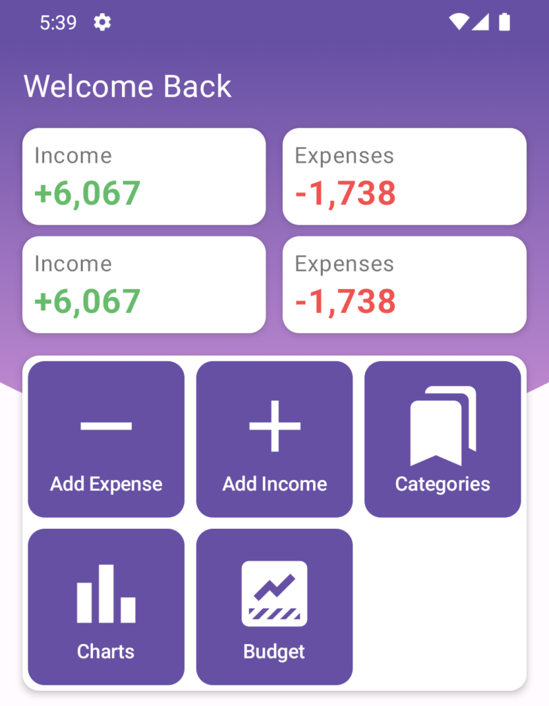
In the image below you can see I added another component and the box resized itself correctly.
Selection Button Animation
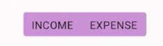
This is a simple filter that uses a box in the background to indicate which option is currently selected.
There are 3 things happening here:
- The box width changes
- The box position changes
- The corner radius changes (take a look at the inner corners when only 1 option is selected)
We use animateDpState to easy animate dp values, unfortunately that’s not possible for corner shapes so we have to create a new shape every time the radius changes.
Then we just need to define the components and Compose handles all of the animation for us, I liked the way this button turned out given its simplicity.
Vertical/Horizontal Scroll
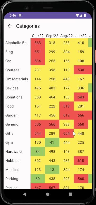
I have a sheet that shows how much I spent by category by month, that’s pretty easy to visualize when you’re using a big screen but for mobile devices I had to come up with a different approach.
I don’t like landscape mode so I didn’t even consider that as an option here. What I ended up doing is making everything scrollable but the months and categories are fixed.
If you take a look again at the video above you can see that whenever I scroll the main content, the other parts are also scrolled. I discovered that it’s possible to use the same ScrollState multiple times, I had no idea this would work but by using the same ScrollState I can get all components to be synchronized.
If you want to see how I built this whole component, you can check this file.
All the code is available in this repository.
I’m far from being an expert in Compose. This article shows how I built these components using the knowledge I had at the time, meaning that this is not necessarily the most performant code nor the simplest way to do a certain thing. If you know of anything that could be improved, please let me know.
Cover photo by Markus Winkler on Unsplash