This is the first article in a new series where I’ll be sharing my journey building a language learning app with Jetpack Compose.
I’ll show you my daily progress, how the app evolved over time, why I made certain decisions, and so on. I’ll also share the new things I learn along the way that might be useful to you.
When I started learning programming, one of my first projects was a website that I used to review words I was learning in other languages. Fast-forward a few years, and now I need something similar. This time, however, I’ll be building it using Jetpack Compose and aiming to publish it to the Play Store.
If you’re a junior engineer, this series will help you by showing how I went from nothing to having an app that’s ready to be published to the Play Store. If you’re a senior engineer, this series will hopefully teach you some new things about Jetpack Compose and might even cause you to rethink the way you solve some problems.
You can find the other articles of the series here:
- Building a Language Learning App with Compose – Part 2
- Building a Language Learning App with Compose – Part 3
Background
I’m calling this app Lingua, it’s “language” in Latin. It’s supposed to be a combination of Duolingo and Anki plus some things I think will be useful.
One of my goals for 2023 is to learn Italian, and I also need to spend some of my time actively creating something instead of just passively learning new things. I’ve read a lot about Compose, now it’s time for me to put that knowledge into practice (later I recognized that I actually knew very little about Compose).
If I arrive at a version that looks good and I think it makes sense, I’ll publish it to the Play Store.
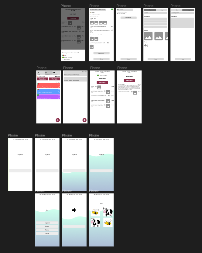
This is the first draft I created in Figma; it is far from the final version but guides me in the right direction.
I’m building this app iteratively, so as you will see the first versions of the app will look pretty ugly but that’s okay, the goal initially is to get something working. Later I can come back to it and improve the design.
I’ll be splitting my updates in days so you can have a notion of how long it took to build this, I’m spending about 1hr on this daily.
Tools and Libraries
For keeping tracking of my tasks I’m using Notion. For the design I’m using Figma.
I’m using Kotlin and Jetpack Compose. The other libraries I’ll mention as I use them.
Day 1
Below you can see my first draft of the home screen. I’ll have some kind of progress section that’ll show how much the user learned in a given day, in a given week and in a given month.
I also want to add some kind of strike feature to motivate people to keep learning. Data is pretty valuable for me so I’ll also add detailed charts about things that might be useful to the user.
Instead of just having the usual “Practice” most apps have I also want to build a custom practice that lets you choose what you want to practice.
And finally, I want to show the list of courses/decks the user is subscribed to. I’ll call these cards “decks” from now on but the name may change in the future.

My screens are divided into route and screen. In the example above I’d create HomeRoute and HomeScreen. The route just is what gets added the the navigation graph, the screen the actual visual content.
Here we have the main NavHost for the application.
NavHost(navController = navController, startDestination = Routes.Home.route) {
    composable(Routes.Home) { HomeRoute(navController) }
}
And here the HomeRoute that defines the home screen.
@Composable
fun HomeRoute(
    navController: NavController,
) {
    HomeScreen(...)
}
I’m just using NavController for now but I’ll probably abstract that later. For routes I just defined a sealed class with my routes, for now this suits my needs but I’ll likely change this too in the future.
sealed class Routes(val route: String) {
    object Home : Routes("/")
}
Keep in mind that this is my first big application with Compose so I’ll certainly make mistakes and learn along the way.
I proceeded to creating the other components but for now I’m just hard coded values to them.
One thing worth mentioning I how I achieved cropping for flag images. I’m using Coil, I was not able to add cropping directly to the image so I wrapped it with a Surface and defined a rounded corner only for the bottom end corner because the top start corner is already cropped by the card. I also set the aspect ratio to 16/9 but I’m not 100% happy with the result.
Surface(
    shape = RoundedCornerShape(bottomEnd = 8.dp),
) {
    AsyncImage(
        model = model.imageUrl,
        contentDescription = "Icon",
        // TODO: add placeholder
        contentScale = ContentScale.FillBounds,
        modifier = Modifier
            .width(36.dp)
            .aspectRatio(16 / 9f)
    )
}
By the end of day 1 I had created the screen you can see below, it’s not functional yet but it’s a good step in the direction I want to go to.

Day 2
On day 2, I just built the library screen, it’s pretty simple right now. It’s just lists the available decks. In the future I’ll add more sorting options to make it easier for the user to find what they want.
It also has a button for the user to create a new deck.

This is what I had achieved by the end of day 2, nothing special. Just a LazyColumn and a FloatingActionButton. I actually also created the ViewModel for this screen so I just need to hook this up to a data source later and the correct data will be listed.

Day 3
On day 3, I started working on the deck creation screen. Basically I need at least one deck with cards to be able to develop the rest of the application so that’s why I’m going this route first.
As you can see below this screen is not as simple as the other ones.
First you can name your Deck, I’ll build this initially.
After that you can change it to public/private, I’ll leave this for later. Everything will be public for now.
On the top right you can see a flag, that’s a cool functionality but I won’t be implementing it right now too.
In the middle we have the most important part of this screens, the cards that compose a Deck. For now there will only be one type of card and it’s just Input <-> Output. For example the English word Bee is Ape in Italian so it’d be something like Bee <-> Ape. This allows me to do a few things:
- Show the word “Bee” and the user has to type “Ape”.
- Show the word “Ape” and the user has to type “Bee”.
- If there are more words I can show something like “Ape” and the user has to choose a word from a list like (“Apple”, “Bee, “Pie”).
This is basically a simple version of Duolingo. Later I’ll be adding support to sound and image but for now that’s just additional complexity.
Finally we have a button to add new cards and a save button to save everything.

I ran into a few problems like how do I pass the deck id to this screen? I’m using the same screen for adding and editing decks so the id had to be an optional parameter. I solved this by creating a new object in Routes and adding the createRoute and parse methods.
object EditDeck : Routes("/deck/{id}/edit") {
    fun createRoute(deckId: String?) = "/deck/$deckId/edit"
    fun parse(bundle: Bundle?): String? = bundle?.getString("id")?.takeIf { it != "null" }
}
And in my routes I added the new route.
composable(Routes.EditDeck) {
    val deckId = Routes.EditDeck.parse(it.arguments)
    EditDeckRoute(navController = navController, deckId = deckId)
}
Then when my screen is created I use a LaunchedEffect to load the deck in the ViewModel.
@Composable
fun EditDeckRoute(
    navController: NavController,
    deckId: String?,
    viewModel: EditDeckViewModel = hiltViewModel()
) {
    LaunchedEffect(deckId ?: "none") {
        viewModel.loadDeck(deckId)
    }

    EditDeckScreen(...)
}
The code inside LaunchedEffect will get executed again if the key changes, in this case, if the deck id changes and that’s exactly what I want.
By the end of day 3 I had built only a small portion of this screen.

Day 4
By day 4 I stopped working on the screen to create decks and moved on to the screen to create cards. Decks and cards are the foundation of this app, everything else in the app will revolve around them.
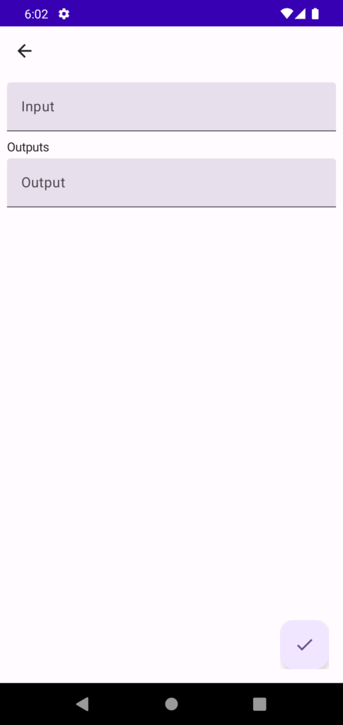
For now I’ll only develop the “Text” type or as I called it earlier Input <-> Output. It’ll contain one field for the input and one field for the output (I need to come up with better names for these things lol).
Later I also want to add a “Info” type that works a little bit differently but that’s for later.

This screen is pretty similar to the previous one, I have my EditDeckCardRoute and EditDeckCardScreen. We also have 2 text inputs and a FAB to save the card.
One difference here is that to create a card I need the deck id and to modify the card I need the card id. To solve this I created 2 routes: EditCard and AddCard.
composable(Routes.AddCard) {
    val deckId = Routes.AddCard.parse(it.arguments)
    EditCardRoute(navController, deckId = deckId)
}

composable(Routes.EditCard) {
    val cardId = Routes.EditCard.parse(it.arguments)
    EditCardRoute(navController, cardId = cardId)
}
The caller decides which route to call based on what it wants to do but on the implementation side I chose to use the same route.
So when the ViewModel is created, it either calls a function to create a new card or one to load an existing card.
fun load(deckId: String?, cardId: String?) {
    when {
        deckId == null && cardId == null -> {
            Logger.e("deckId and cardId are null")
            // navigate up
        }
        deckId != null -> createNewCard(deckId)
        cardId != null -> loadCard(cardId)
    }
}
Here’s what this screen looks like by end of day 4. Pretty simple screen but now I can at least create simple cards and add them to a given deck.
In this update we went over the first 4 days of this app. I shared what I’ll be building and why. I also described what I built on each day and a little bit of how it was built.
I’m enjoying this new series a lot and I’m hoping you’re too. If you liked this update please share it with your friends, coworkers, ….
Stay tuned for the next updates.
Cover photo by Kelly Sikkema on Unsplash.