In this article I’ll show you how to build a 24h time picker dialog using Jetpack Compose.

Let’s start by defining a component for the timer picker itself, not the dialog. That way we can reuse the time picker in other parts of the application even outside a dialog.
@Composable
fun TimerPicker(
    onCancel: () -> Unit,
    onOk: (Time) -> Unit,
    modifier: Modifier = Modifier
)
onCancel is called when the cancel button is pressed. onOk is called when the ok button is pressed.
Time is just a data class that contains the hour and minute.
data class Time(val hour: Int, val minute: Int)At the beginning of the TimerPicker composable we need to define a few variables.
var selectedPart by remember { mutableStateOf(TimePart.Hour) }

var selectedHour by remember { mutableStateOf(0) }
var selectedMinute by remember { mutableStateOf(0) }
val selectedIndex by remember {
    derivedStateOf { if (selectedPart == TimePart.Hour) selectedHour else selectedMinute / 5 }
}

val onTime: (Int) -> Unit = remember {
    { if (selectedPart == TimePart.Hour) selectedHour = it else selectedMinute = it * 5 }
}
selectedPart indicates if we should display the hours or the minutes. selectedHour stores the hour the user selected. selectedMinute stores the minute the user selected.
selectedIndex represents the position in the clock, for hours it’s the hour(0-23) but for minutes it’s the hour in the same position. For example, for 15mins it’s 3, for 40mins it’s 8. We need to divide selectedMinute by 5 because that’s the corresponding hour.
enum class TimePart { Hour, Minute }TimePart is just an enum that represents what’s selected(hours or minutes).
Above the clock, there are 2 cards, one for hours and the other for minutes, I called them TimeCard.
@Composable
fun TimeCard(
    time: Int,
    isSelected: Boolean,
    onClick: () -> Unit
) {
    Card(
        shape = RoundedCornerShape(6.dp),
        backgroundColor = if (isSelected) selectedColor else secondaryColor,
        modifier = Modifier.clickable { onClick() }
    ) {
        Text(
            text = if (time == 0) "00" else time.toString(),
            fontSize = 32.sp,
            color = if (isSelected) secondaryColor else Color.White,
            modifier = Modifier.padding(horizontal = 12.dp, vertical = 4.dp)
        )
    }
}
It’s just a card that displays the selected hour and minute. This is how they are placed in the TimerPicker component.
Row(
    modifier = Modifier.align(Alignment.CenterHorizontally)
) {
    TimeCard(
        time = selectedHour,
        isSelected = selectedPart == TimePart.Hour,
        onClick = { selectedPart = TimePart.Hour }
    )

    Text(
        text = ":",
        fontSize = 32.sp,
        color = Color.White,
        modifier = Modifier.padding(horizontal = 2.dp)
    )

    TimeCard(
        time = selectedMinute,
        isSelected = selectedPart == TimePart.Minute,
        onClick = { selectedPart = TimePart.Minute }
    )
}
Whenever they are pressed, we update selectedPart based on which one was pressed.
Now we get to the actual clock.
@Composable
fun Clock(
    index: Int,
    modifier: Modifier = Modifier,
    content: @Composable () -> Unit
) {
    val localDensity = LocalDensity.current

    var radiusPx by remember { mutableStateOf(0) }
    val radiusInsidePx by remember { derivedStateOf { (radiusPx * 0.67).toInt() } }

    var indexCirclePx by remember { mutableStateOf(36f) }
    val padding by remember {
        derivedStateOf { with(localDensity) { (indexCirclePx * 0.5).toInt().toDp() } }
    }
...
}
index represents a number from 0 to 23 that’s the index that’s currently selected.
radiusPx is the radius of the outer circle(0-11) and radiusInsidePx is the radius of the inner circle(12-23).
Below that I declared two functions to calculate the position of the index on the clock.
fun posX(index: Int) =
    ((if (index < 12) radiusPx else radiusInsidePx) * cos(angleForIndex(index))).toInt()

fun posY(index: Int) =
    ((if (index < 12) radiusPx else radiusInsidePx) * sin(angleForIndex(index))).toInt()
If the index is smaller then 12, it means the time goes in the outer circle. If it’s bigger than or equal to 12, it goes in the inner circle.
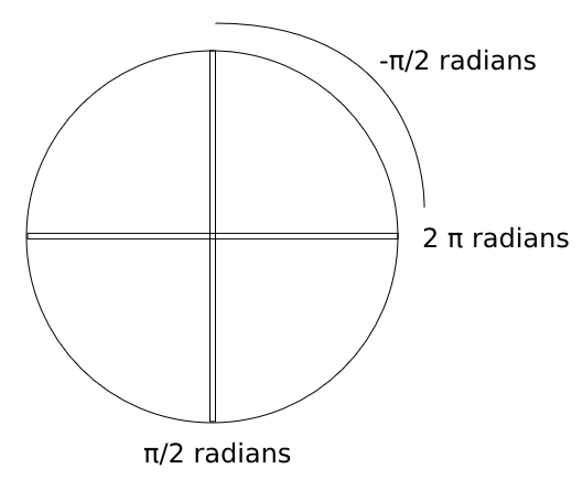
private const val step = PI * 2 / 12
private fun angleForIndex(index: Int) = -PI / 2 + step * index
We don’t use degrees when drawing, instead we use radians. 1 π radians is equivalent to 180° so π * 2 / 12 is the step for each index(360° / 12).
angleForIndex just calculates the angle based on the index. 0° is not at the top, it’s at 3 o’clock. We need to reduce 90° to make sure index 0 is at what we consider to be 0°. angleForIndex starts with -π / 2 because π / 2 is 90° so -π / 2 is -90°, that’s where the index 0 stars.
Now we finally come to the code that draws the clock, this is still inside the Clock composable.
Box(modifier = modifier) {
    Surface(
        color = primaryColor,
        shape = CircleShape,
        modifier = Modifier.fillMaxSize()
    ) {}

    Layout(
        content = content,
        modifier = Modifier
            .padding(padding)
            .drawBehind {
                val end = Offset(
                    x = size.width / 2 + posX(time),
                    y = size.height / 2 + posY(time)
                )

                drawCircle( // #1
                    radius = 9f,
                    color = selectedColor,
                )

                drawLine( // #2
                    start = center,
                    end = end,
                    color = selectedColor,
                    strokeWidth = 4f
                )

                drawCircle( // #3
                    radius = indexCirclePx,
                    center = end,
                    color = selectedColor,
                )
            }
    ) { measurables, constraints ->
        val placeables = measurables.map { it.measure(constraints) }
        assert(placeables.count() == 12 || placeables.count() == 24) { "Invalid items: should be 12 or 24, is ${placeables.count()}" }

        indexCirclePx = (constraints.maxWidth * 0.07).toFloat() // #4

        layout(constraints.maxWidth, constraints.maxHeight) {
            val size = constraints.maxWidth
            val maxElementSize = maxOf(placeables.maxOf { it.width }, placeables.maxOf { it.height })

            radiusPx = (constraints.maxWidth - maxElementSize) / 2 // #5

            placeables.forEachIndexed { index, placeable ->
                placeable.place( // #6
                    size / 2 - placeable.width / 2 + posX(index),
                    size / 2 - placeable.height / 2 + posY(index),
                )
            }
        }
    }
}
I’m using a layout so we can choose where to position the elements.
#1 draws a small circle at the center of the clock.
#2 draws a line between the circle at the center and the selected index.
#3 draws a circle at the selected index.
#4 calculates the selected index circle radius based on the clock size.
#5 the radius for the outer circle is just the available space divided by 2.
#6 places the elements centered at their position.
Going back to TimerPicker we insert the Clock element. The aspectedRatio is set to 1 so it’s always a square.
Clock(
    time = selectedTime,
    modifier = Modifier
        .aspectRatio(1f)
        .align(Alignment.CenterHorizontally)
) {
    ClockMarks24h(selectedPart, selectedTime, onTime)
}
ClockMarks24h has the elements for a 24-hour clock.
@Composable
fun ClockMarks24h(selectedPart: TimePart, selectedTime: Int, onTime: (Int) -> Unit) {
    if (selectedPart == TimePart.Hour) {
        Mark(text = "00", index = 0, isSelected = selectedTime == 0, onIndex = onTime)
        (1..23).map {
            Mark(text = it.toString(), index = it, isSelected = selectedTime == it, onIndex = onTime)
        }
    } else {
        Mark(text = "00", index = 0, isSelected = selectedTime == 0, onIndex = onTime)
        Mark(text = "05", index = 1, isSelected = selectedTime == 1, onIndex = onTime)
        (2..11).map {
            Mark(text = (it * 5).toString(), index = it, isSelected = selectedTime == it, onIndex = onTime)
        }
    }
}
The Mark composable is what represents the hour and minute. It’s a normal component so it can be styled however you want.
@Composable
fun Mark(
    text: String,
    index: Int, // 0..23
    onIndex: (Int) -> Unit,
    isSelected: Boolean
) {
    Text(
        text = text,
        color = if (isSelected) secondaryColor else Color.White,
        modifier = Modifier.clickable(
            interactionSource = remember { MutableInteractionSource() },
            indication = null,
            onClick = { onIndex(index) }
        )
    )
}
Finally we can create a component for the dialog and put the TimerPicker inside it.
@Composable
fun TimerPickerDialog() {
    val localContext = LocalContext.current

    Dialog(onDismissRequest = { /*TODO*/ }) {
        Box(modifier = Modifier.fillMaxWidth()) {
            TimerPicker(
                onOk = { Toast.makeText(localContext, it.toString(), Toast.LENGTH_SHORT).show() },
                onCancel = {},
                modifier = Modifier
                    .fillMaxWidth(0.8f)
                    .align(Alignment.Center)
            )
        }
    }
}
The final result:

If you want to see the whole source code, you can check it out here.
If you have any comments or suggestions, please reach out to me on Twitter.
Photo by Ales Krivec on Unsplash