Today we’ll learn how to use shared element transitions in Jetpack Compose.
Make sure you’re using at least Compose 1.7.0-beta01, if you’re using the Compose BOM to import libraries you can override it
implementation platform('androidx.compose:compose-bom:2024.06.00')
implementation "androidx.compose.ui:ui:1.7.0-beta04" // <- overrides the version from the BOM
Here’s the base code I’ll be using
@Composable
fun App() {
MaterialTheme {
Surface(
modifier = Modifier.fillMaxSize()
) {
var showDetails by remember { mutableStateOf(false) }
SharedTransitionLayout {
AnimatedContent(
showDetails,
label = "basic_transition",
modifier = Modifier
.padding(8.dp)
) { targetState ->
Box(Modifier.fillMaxSize()) {
if (!targetState) {
with(this@SharedTransitionLayout) {
Box {
Text(
text = "hello",
fontSize = 25.sp,
modifier = Modifier
.clickable { showDetails = !showDetails }
)
}
}
} else {
with(this@SharedTransitionLayout) {
Box(
modifier = Modifier.padding(50.dp)
) {
Text(
text = "hello",
fontSize = 25.sp,
modifier = Modifier
.clickable { showDetails = !showDetails }
)
}
}
}
}
}
}
}
}
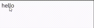
}Here we can see what happens if you just use AnimatedContent
Now if we change the Text composable to use sharedElement
Text(
    text = "hello",
    fontSize = 25.sp,
    modifier = Modifier
        .clickable { showDetails = !showDetails }
        // use the same key for the components you want to share
        .sharedElement(
            rememberSharedContentState(key = "text"),
            animatedVisibilityScope = this@AnimatedContent
        )
)
Here’s what it looks like
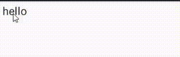
We can see that it’s animating the padding and because Compose now knows the text composable is the same in both cases it can animate it.
Let’s build a card that expands into a bigger view.

First I refactored the content of AnimatedContent to make the code easier to read
SharedTransitionLayout {
    AnimatedContent(
        showDetails,
        label = "basic_transition"
    ) { targetState ->
        Box(Modifier.fillMaxSize()) {
            if (!targetState) {
                LessonCard(
                    { showDetails = true },
                    this@SharedTransitionLayout,
                    this@AnimatedContent
                )
            } else {
                LessonDetail(
                    { showDetails = false },
                    this@SharedTransitionLayout,
                    this@AnimatedContent
                )
            }
        }
    }
}
To get the animation to work correctly for the Text composable I had to use sharedBounds instead of sharedElement. There are some differences, you can learn about them here.
@OptIn(ExperimentalSharedTransitionApi::class)
@Composable
private fun LessonCard(
    showDetails: () -> Unit,
    sharedTransitionScope: SharedTransitionScope,
    animatedContentScope: AnimatedContentScope
) {
    with(sharedTransitionScope) {
        Card(
            modifier = Modifier
                .padding(12.dp)
                .clickable { showDetails() }
        ) {
            Column(
                modifier = Modifier
                    .fillMaxWidth()
                    .padding(8.dp)
            ) {
                Text(
                    text = "Lesson 1",
                    fontSize = 25.sp,
                    modifier = Modifier
                        .sharedBounds(
                            rememberSharedContentState(key = "title"),
                            animatedVisibilityScope = animatedContentScope
                        )
                )
                Text(
                    text = "Let's learn about Compose",
                    fontSize = 14.sp,
                    modifier = Modifier.sharedBounds(
                        rememberSharedContentState(key = "subtitle"),
                        animatedVisibilityScope = animatedContentScope
                    )
                )
            }
        }
    }
}
Here’s the expanded composable:
@OptIn(ExperimentalSharedTransitionApi::class)
@Composable
private fun LessonDetail(
    hideDetails: () -> Unit,
    sharedTransitionScope: SharedTransitionScope,
    animatedContentScope: AnimatedContentScope
) {
    with(sharedTransitionScope) {
        Column(
            horizontalAlignment = Alignment.CenterHorizontally,
            modifier = Modifier
        ) {
            Text(
                text = "Lesson 1",
                fontSize = 35.sp,
                modifier = Modifier
                    .clickable { hideDetails() }
                    .sharedBounds(
                        rememberSharedContentState(key = "title"),
                        animatedVisibilityScope = animatedContentScope
                    )
                    .padding(vertical = 16.dp)
            )
            Text(
                text = "Jetpack Compose is a ....",
                fontSize = 14.sp,
                modifier = Modifier
                    .fillMaxWidth()
                    .sharedBounds(
                        rememberSharedContentState(key = "subtitle"),
                        animatedVisibilityScope = animatedContentScope
                    )
                    .padding(12.dp)
            )
        }
    }
}
If you have any comments or suggestions, please reach out to me on Twitter.
Photo by Jigar Panchal on Unsplash
Sources: